Nice to meet you, color! Color terminology explained.
Nice to meet you, color! Color terminology explained.
Building on our article “Hello, Color!”, published last week, we’re going to cover some common color terminology. This will help you have conversations with team members and designers when you’re creating the look and feel of your app. Here we go with “color terminology explained”!
Color terminology explained
1. Color basics
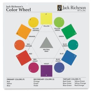
The color wheel (the graphic on the right) is used in classical color theory based on painting and the color spectrum of the rainbow. It’s depicted in a circular shape which easily displays all twelve colors in the visible color spectrum. The color wheel is very helpful for understanding the relationships between colors and for creating harmonious color combinations and palettes.
Hue is essentially the name of a pure color we use as a starting place to then create various shades, tints, and tones. When you choose a color from the color wheel, like blue-violet, or green, you’re choosing a hue.
Foundational colors may also be thought of as background colors. They may be pure neutrals, black and white, or subtle tints and shades of those or other main colors in your scheme.
Tints are lighter versions of any color that are created by adding white.
Shades are darker versions of any color that are created by adding black.
Tones are created with a slightly more complex process compared to a tint or shade. Creating a tone involves adding both black and white (ie. grey) to a hue to “tone it down” and make it appear duller, or more neutral, than the original hue.
Saturation of a color indicates how pale or how bold it is, in relation to how it appears in both bright and weak light. Changing the saturation of a hue does not involve mixing it with other colors, but it does involve changing the intensity of the color.
2. Color 1-2-3
 Primary colors are the three colors that every other color is created from: in a classic color wheel, and when using paint or similar medium, the primary colors are red, blue, and yellow. In an additive system, like RGB, the primary colors are red, green, and blue; whereas in a subtractive system, like CMYK, the primary colors are cyan, magenta, and yellow. In all of these systems, you cannot create the primary colors out of any other color, you must start with them.
Secondary colors on the color wheel are orange, green, and violet. They’re created by mixing equal amounts of the two primary colors on either side of them on the color wheel: red and yellow make orange; yellow and blue make green; blue and red make violet. In RGB and CMYK systems, your secondary combinations will be slightly different.
Tertiary colors are created by combining the two colors next to each other For example, referencing our trusty color wheel, combining half yellow and half green makes a color called yellow-green (or green-yellow, which is exactly the same). See the whole list of tertiary colors at the bottom of the color wheel graphic above.
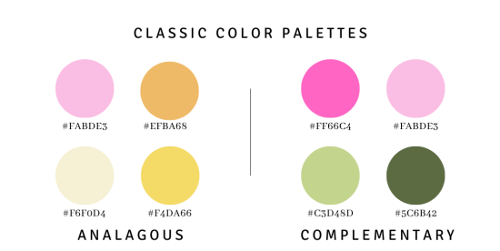
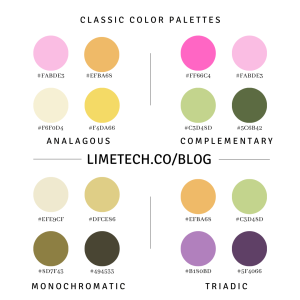
3. Common color palettes
 Check out examples of all these combinations in last week’s article.
Analogous colors are next to each other on the color wheel. Yellow, yellow-green, and green are considered analogous colors.
Complementary colors are opposite each other on the color wheel. Red and green; Blue and Orange; Yellow and Violet are all complementary color pairs.
Grayscale is a color scheme which is composed entirely of shades of gray, the darkest tone being black.
Monochromatic palettes use tints and shades of one color to make a harmonious scheme.
Triadic — A triadic color scheme integrates three colors that are evenly spaced out on the color wheel. Referencing the wheel at the top of this article, the most recognized triadic color combination includes the three primary colors: red, blue, yellow. That’s followed closely by the three secondary colors: orange, green, violet.
4. Color codes
 CMYK is a color model used for color printing; it includes the colors cyan, magenta, yellow, and key (black). Each color represents one screen used in the printing process.
Hexadecimal code/Hex codes are the number-and-letter-combination codes that correspond to a unique definition for every color available on a RGB display –any computer or other digital screen including mobile phones.
RGB is an additive color model in which colors are created by adding various ratios of red, green, and blue. RGB is used for digital content displayed on computers and smartphones.
5. UI uses of color
 Denotative colors are purpose-oriented: they use color to help you move around an application or program. Denotative buttons tell you to “submit” your information and to navigate to the “next” screen.
Interactive colors are assigned to interactive elements, such as hover-over buttons, clickable links, buttons. You want the color for these elements to stand out from the background so users can find them easily.
Now that you’ve had color terminology explained, you can feel more comfortable communicating with your team about your app project. Go ahead and ask your designer to bring down the saturation on that burnt orange hue you love, but is slightly dominating your palette. You’re ready to talk color!
Still got questions? Here are more articles and resources for learning about color theory and how to apply it to your projects.
A Color Wheel (physical product)
A 7 Step Guide to Understanding Color Theory
7 Steps to Organize Colors for UI Design
Editor’s note: This article was created collaboratively by Kerry Abukhalaf and Addie Kugler-Lunt.
LimeTech is a creative tech company with a focus on innovation and adaptive change. We use technical know-how, design skills, and deep experience in entrepreneurship to help companies advance their business goals. Our specialties include mobile app development, website design, technology planning, and remote work solutions.