Hello, color! How to choose the right colors for your app.
Hello, color! How to choose the right colors for your app.
So, you’re building an app and you’re starting to think about your product’s look and feel. This process usually starts with branding and logo design, but sometimes an entrepreneur or designer starts with UI design. Either way, you need to set the mood for your customers, and color is your most powerful tool to get this done. Say, “Hello, color!”. Here’s how to choose the right colors for your app (without your eyes going buggy in the process).
Color is a vast topic. In fact, did you know that using standard hex codes (more on this later), we can notate more than 16 million different colors? From the outset, your biggest challenge will be to narrow down your options to a select few colors that suit your brand.
Here we present a primer on the science of color to help make your decisions around color a little easier.
The color wheel
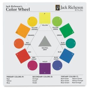
Twelve colors (along with black and white) form the basis for every color that can be created in the visible color spectrum. Regardless of whether you’re printing, painting on paper, or creating digitally, understanding the color wheel is essential. Even if you’re not creating the design yourself, a common language of color is extremely helpful in working with a designer.
Primary colors
The color wheel starts with the three primary colors: red, blue, and yellow. You can see these colors arranged in a triangle relationship in the graphic below. Every other color in the entire color spectrum is created out of a combination of these three primary colors. You cannot create these colors from any other color; you have to start with them. They are your foundation for the entire rainbow.
Secondary colors
The secondary colors: orange, green, and violet are created by combining two of the primary colors together. They are shown in relation below, in the inverted triangle. If you add the secondary colors to the primary ones you get the classic R-O-Y-G-B-V rainbow colors.
Tertiary colors
Lastly, we have tertiary colors–represented by circles in the graphic below. These colors are created by combining the two colors next to each other. For example, combine half yellow and half green to make a color called yellow-green (or green-yellow, which is the same). See the whole list of tertiary colors at the bottom of the graphic below. Also note, tertiary colors are not the same as tints or shades: tints are lighter versions of any color, created by adding white; shades are darker versions of any color that are created by adding black to a color.
Notes on RGB and CMYK*
In this article we’re discussing traditional color theory, which uses the colors in the color wheel above. We’re focusing on how these colors can be combined in different ways to make harmonious palettes which can be used for various applications including websites and apps. For the science behind how colors are reproduced for printing, using CYMK, or created on screens/digitally, using RGB, read this article.
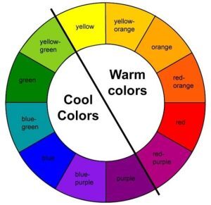
Warm colors, cool colors
The easiest way to distinguish warms vs. cools is to think about two simple aspects of nature: The colors associated with the sun’s warmth: yellows, oranges, and reds are all warm colors. The colors associated with water’s coolness: blues, greens, and violets are all cool colors. The color wheel below shows this classification.
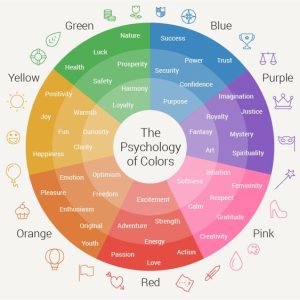
Color sets the mood
First of all, let’s put it front and center: color sets the mood. Each color can be associated with certain attributes or psychological states. Keep in mind that color associations can vary across cultures. Here are some colors and the moods they convey (in Western culture):
Red: excitement, energy, strength, adventure, action, passion, love (also hunger and desire)
Orange: optimism, freedom, pleasure, rejuvenation
Yellow: joy, positivity, clarity, confidence, enthusiasm, curiosity
Green: loyalty, harmony, prosperity, safety, luck, health, balance
Blue: trust, honesty, confidence, security, success, intelligence
Purple: royalty, spirituality, fantasy, imagination, mystery, justice
Pink: femininity, calm, softness, respect, gratitude, creativity
Take time to consider the mood of your app, and how it relates to your target user(s). Establishing the attributes or mood will help you choose the main color for your project. In fact, the mood can be your north star, helping you make important choices throughout this process. Settle on your main color (or base color) and you can begin working with color combinations.
Combining colors — analogous, complementary, monochromatic, triadic palettes
If you’ve ever attended an art or design class, even as a kid, you likely remember something about how the color wheel is used to find and create harmonious color combinations. Keep in mind there are many more combinations than the classics we’re going to discuss here. However, once you have a handle on these, you’ll be able to create pleasing palettes of your own and/or have a conversation with a designer. If you’re new to creating color combinations, keep your color wheel close by for reference and it will all start to make sense.
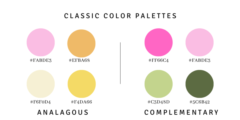
Analogous color palettes
Analogous — The easiest way to create an analogous palette is by following this process: Start by choosing one color on the color wheel. You can call this your main color. Then, add an adjoining one. For example, start with yellow, and then add orange. Next, you’ll choose between two options: 1. Add red — the color next to orange (the example below uses pink, a lighter version of red) OR 2. instead of orange, move the opposite direction on the color wheel to yellow’s other neighbor, green. Either of these combinations of three: red, orange, yellow OR orange, yellow, green can be the basis of an analogous color scheme.
On the cooler side of the color spectrum, a green, blue, violet combination would also be analogous. You’re not limited to just warms or cools in an analogous scheme: warms and cools work together in an analogous palette, as long as they are next to each other on the color wheel: red, violet, and blue would be one example.
Complementary color palettes
Complementary — These palettes may be the easiest to spot, as they are inherently attractive and eye-catching. In Western culture, when people think about Christmas colors, they typically visualize a complimentary color scheme: red and green. These colors are opposite each other on the color wheel — the complete opposite of the analogous colors we discussed above.
In the first graphic of the color wheel above, you can quickly see the other complementary combinations: orange and blue, and yellow and violet. Classically, there are only two colors in a complimentary palette. So what if you want a third or a fourth color? You can add tints and/or shades of one or both of the two complementary colors. In the example below, we chose two tints of red (ie. pinks) and two greens (one tint and one shade) to create four harmonious colors for the palette.
Monochromatic color palettes
Monochromatic — The simplest of all color schemes is monochromatic. All you need is one main color! In the example below, we’ve used a warm green-yellow as the basis for the palette. Then, tints and shades of that same color are brought in to make several harmonious colors that work well together. This is undoubtedly the subtlest of the classic color combinations. Many of the color tools referenced below can assist you in locating the tints and shades of a color quickly. So if you are drawn to this look for your product, website, or app, this is an easy way to go.
Triadic color palettes
Triadic — This is the most complex of the classic color combinations because we’re veering away from both direct opposites and also neighbors on the color wheel. But don’t be put off because triadic color palettes are some of the most recognizable and commonly used schemes out in the world. Referencing our favorite color wheel tool at the top of this article, the triangle or inverted triangle is our starting place. The most classic triadic combination is the three primary colors: red, blue, yellow. It’s instantly recognizable and always looks good! That’s followed closely by the secondary colors: orange, green, violet, which is what’s used in the example below.
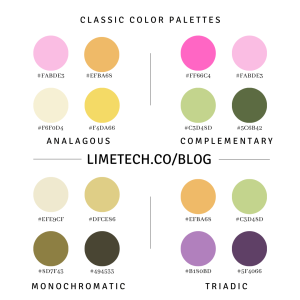
Notes on hex codes*
As seen in the graphic above, the numbers and letters below each circle of color correspond to a unique hexadecimal code (or “hex code”). This code indicates how the digital RGB colors are combined to create each color. You’ll see hex codes in the color apps and tools listed below. Once you’ve decided on your color palette, you and your designers use the hex codes to make sure all the colors remain consistent across every screen and marketing campaign. If you have a company or product style guide, the hex colors should be indicated there. Read more about hex codes in this article.
Notes on Neutrals*
Pure neutrals like black and white are often included in addition to your color palette, as backgrounds for the main colors. Tinted and shaded neutrals, containing a tiny bit of one of your main colors, can be used in one of two primary ways: either as neutrals in addition to the main palette to replace black and white OR as part of the main palette colors in schemes that have fewer colors overall (especially in monochromatic palettes).
Examples of each classic color combination:
- Analogous scheme: yellow, orange, and green
- Complementary scheme: orange and blue
- Monochromatic scheme: blues
- Triadic scheme: orange, green, violet
UI/UX methods with color
Once your color palettes are chosen, you can start to dive into the UI/UX design process. When doing layouts, especially when you’re designing mobile app screens, the following tips can help guide your way:
- Start with grayscale. Create user flows and screen hierarchies first, using a grayscale color palette. This will help you choose page elements without being distracted by color choices.
- Less is more. Research has shown that consumers prefer a maximum of three main colors in a design palette. In fact, the inclusion of too many colors is a classic mistake of newbie designers. Keep your color palette simple, and users will thank you.
- UI design is organizational, and the purpose of any element should be discernible by the color and design — this is a fundamental principle of good UI/UX design.
- Standardize your foundational colors. Designate color codes for neutral colors like white, black, and gray. White doesn’t have to be extreme white; consider using eggshell or vanilla.
- Standardize your denotative colors. Denotative colors are purpose-oriented. For example, use red text for error messages and green text for success messages.
- Standardize your interactive colors. Assign color choices to interactive elements, such as hover-over buttons, clickable links, and more. For elements that are classically 3D in nature (buttons, for example), consider the role of light. For example, a button in its natural state would be raised and would catch more light than a button that is hovered over. Therefore, a button selected via hover would have a darker shade than one its natural state. Note: this is not a hard and fast rule.
- Design for accessibility. Users with vision challenges will benefit from high-contrast color schemes. Also take into consideration the needs of color-blind users, especially when using reds and greens. For these two colors, be sure to include a label that indicates the utility or function of the feature. These tools can help you make choices around accessibility.
- Test, test, test. As with anything, always conduct testing. Compare color options side by side and test them on real users if you can. At its most basic level, testing can even be as simple as pulling aside a colleague and asking for their input. Your designs will inevitably benefit from multiple perspectives.
Tools for your kit
If you’re ready to do a deep dive into color combinations, you’re in luck; there are some great tools available to help you find the right combinations for your app. Here are a few of our favorites:
Coolors A fast, easy color schemes generator. Watch out — the “slot machine” format of their generator makes it a bit addictive!
Adobe Color Tool More complex than Coolors, Adobe’s tool is an interactive version of the classic color wheel, and can generate palettes based on chosen criteria.
ColorPick Eyedropper A Chrome extension that helps you identify hex codes for colors you find around the web.
Brandmark Color Wheel An AI tool that applies color palettes to your uploaded graphics.
Canva Upload a photo and Canva can identify the colors in it, to assist in your creating a palette. You can easily refine the colors and pull out shades or tints that work for you. Great for content creation and quick mockups!
Summary of how to choose the right colors for your app
We’ve just touched the tip of the iceberg when it comes to color combinations, palettes, and UX/UI color strategy. Hopefully we’ve given you a broad-enough overview to set you on the right path. With a color wheel in hand and a good grasp of the main concepts, you should feel comfortable enough to start playing. And in no time you’ll be talking shop with your design team, or even mocking up your own designs with a bit more confidence.
If you’d like to design and build you mobile app with a skilled, creative team, LimeTech is ready. Submit our contact form and we’ll get back to you to schedule a conversation about your project.
Editor’s note: This article was created collaboratively by Kerry Abukhalaf and Addie Kugler-Lunt.
LimeTech is a creative tech company with a focus on innovation and adaptive change. We use technical know-how, design skills, and deep experience in entrepreneurship to help companies advance their business goals. Our specialties include mobile app development, website design, technology planning, and remote work solutions.


